a2-DataVis-5ways
Assignment 2 - Data Visualization, 5 Ways
Claire Desrosiers
Link: https://cdes404.github.io/a2-DataVis-5ways/
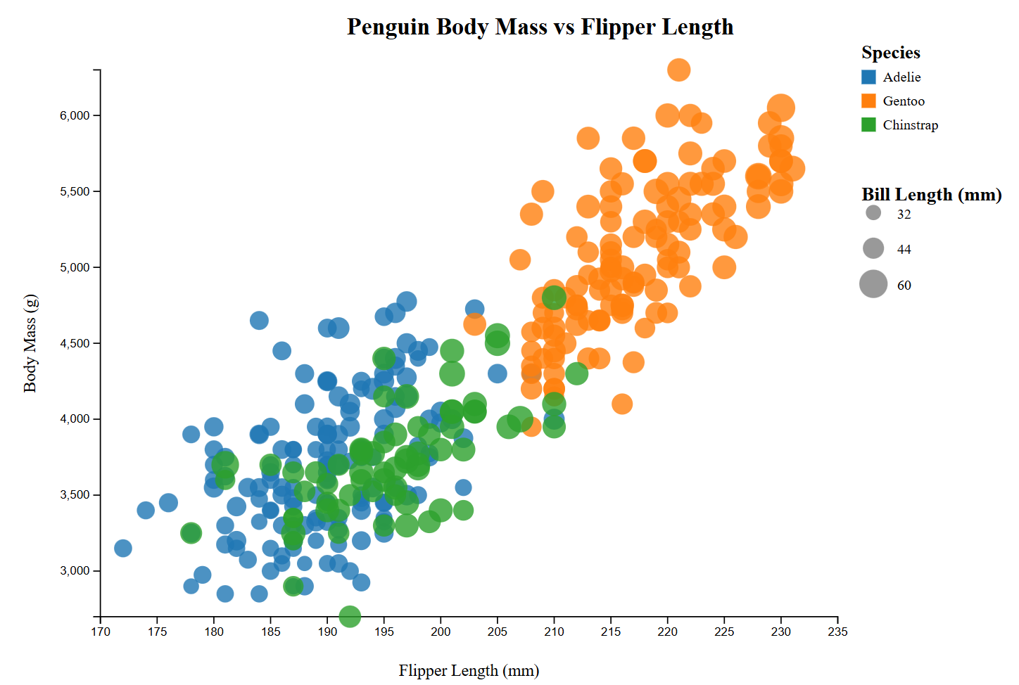
1. d3.js
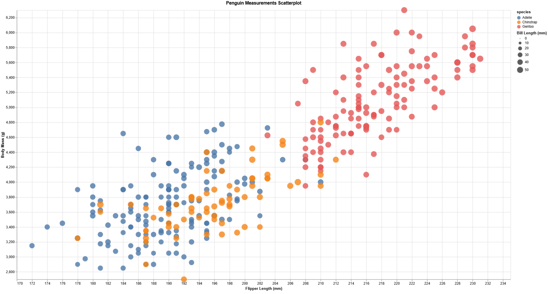
I loaded the CSV file using d3.csv(), mapped the flipper length and body mass to x and y axes, and set color and size scales for species and bill length.
- Easy: Mapping data to axes using
d3.scaleLinear()and creating axes. - Difficult: Handling asynchronous data loading and making sure points render only after the CSV is loaded.
- Usefulness: Ideal for interactive web visualizations and custom designs.
- Hacks/Data manipulation: Filtered out rows with missing bill length values to avoid rendering errors.
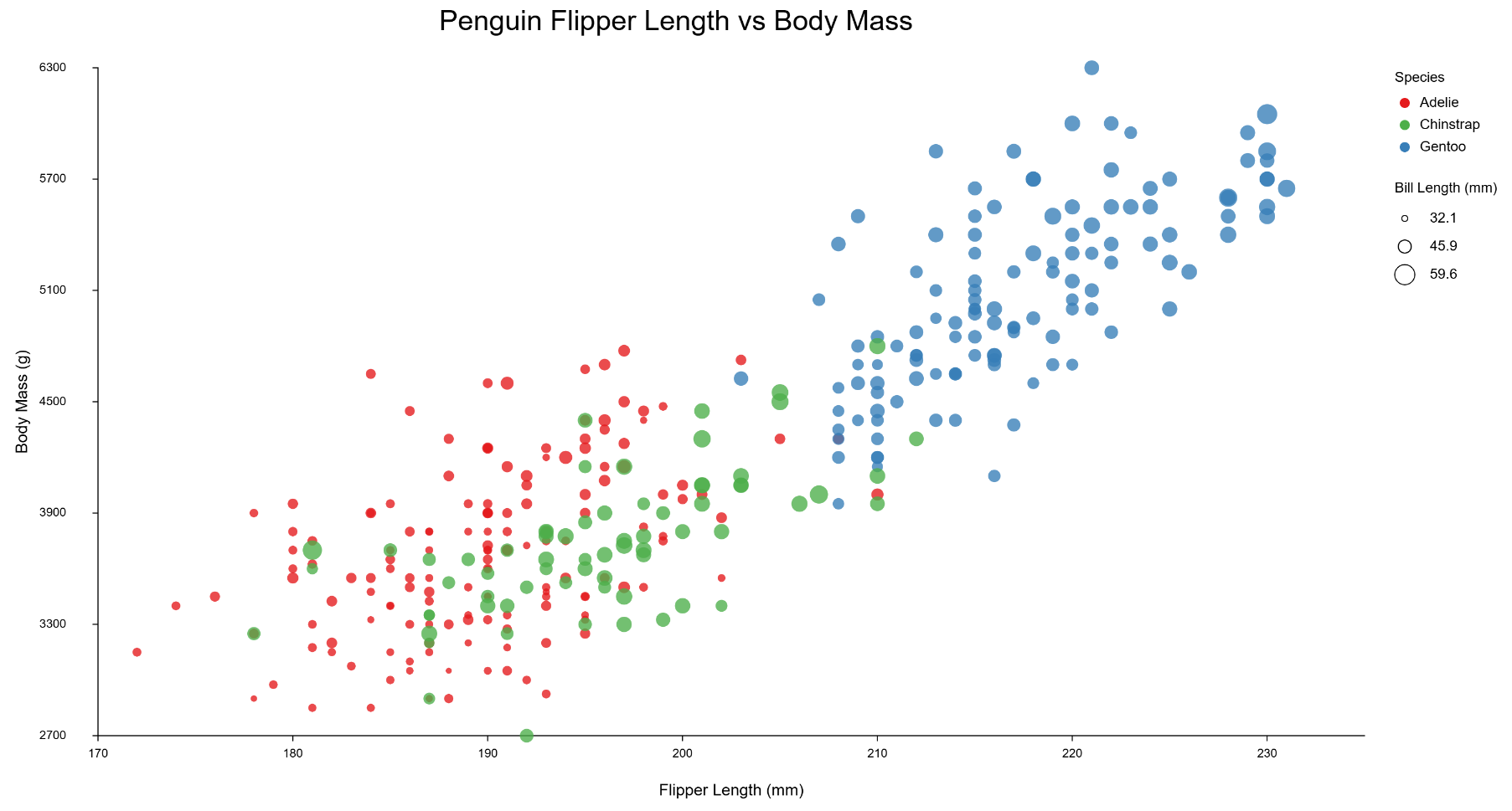
2. p5.js
I used p5.js to draw circles for each penguin, scaling the x and y positions manually and mapping color and size to the data.
- Easy: Drawing and styling circles on canvas.
- Difficult: Manually creating axes and scales, no built-in chart functions.
- Usefulness: Great for artistic or experimental visualizations where traditional chart libraries are limiting.
- Hacks/Data manipulation: Normalized flipper length and body mass to fit canvas dimensions.
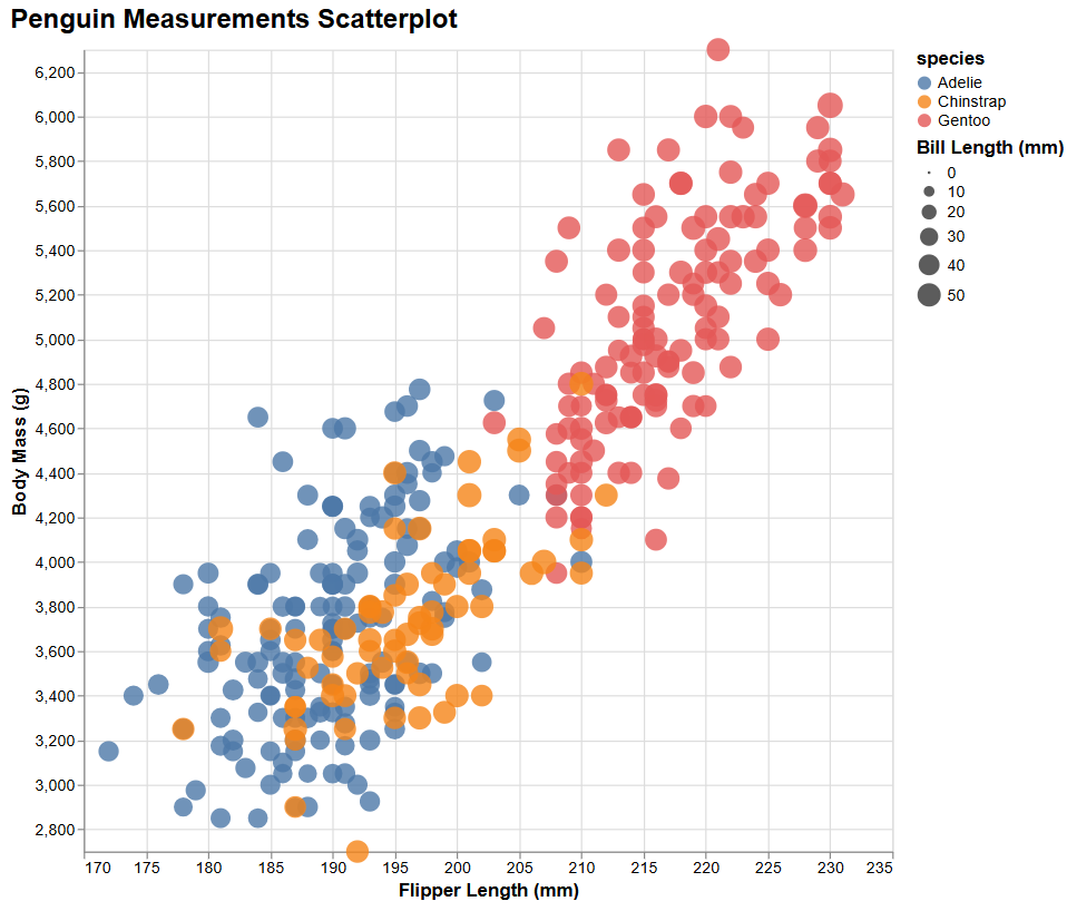
3. Altair (Python)
I created the scatterplot using alt.Chart() with .mark_circle(), encoding x, y, color, and size directly from the dataset.
- Easy: Declarative syntax made mapping data attributes simple.
- Difficult: Customizing axes scales beyond the default required some extra parameters.
- Usefulness: Excellent for quick, clean visualizations in Python with minimal code.
- Hacks/Data manipulation: Dropped missing values using
pandas.dropna()to avoid plotting errors.
4. Plotly (Python)
I used px.scatter() to map flipper length vs. body mass, setting color to species and size to bill length, with opacity set to 0.8.
- Easy: Interactive plots with hover info are built-in.
- Difficult: Adjusting axes to match the example scales.
- Usefulness: good for dashboards or sharing interactive charts online.
- Hacks/Data manipulation: Filtered dataset to remove missing bill lengths.
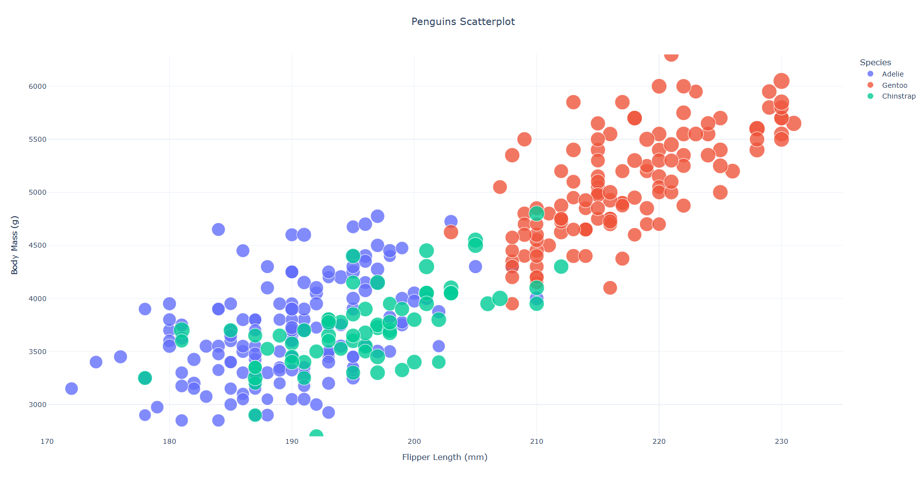
5. Vega-Lite
I defined a JSON specification for the scatterplot, encoding x, y, color, size, and opacity.
- Easy: Declarative JSON made reproducing the scatterplot straightforward.
- Difficult: Understanding Vega-Lite syntax for size and color scaling.
- Usefulness: Good for formal, shareable visualization specifications that are portable across platforms.
- Hacks/Data manipulation: Adjusted axis scales to approximate the example plot.
Technical Achievements
- Interactive visualizations - hover interactions for d3.js and Plotly plots
- Data cleaning - iltered missing bill length values consistently across all tools.
Design Achievements
- Color consistency: Species colors were kept consistent across all five visualizations.
- Opacity for overlapping points: All scatterplots use semi-transparent circles for better visibility.
- Readable axes and labels: Customized tick intervals and labels for clarity.
- Size mapping: Bill length consistently used for circle size to highlight variation.